
STARBUCKS Business Case Study and App Re-Design
Project: Academic
Role:
-
Secondary Case Study Analysis
-
User Research, Interviews, and Analysis
-
Idea Generation
-
App Re-Design
-
Iteration and Feedback Sessions
-
Usability Testing and Evaluation
-
Hi-fi prototyping
Timeline: 2 weeks, 12 October 2022- 24 October 2022
Overview
The aim of this project was to do an extensive study on the business model (SWOT analysis, Business Model Canvas, and Porter's five forces) and add to Business Opportunities and Digital Customer Experience by analyzing the current experience via Jacob Neilsen Usability Heuristics.

Enhancing the Digital Experience
Heuristic evaluation research for the user flow of Starbucks mobile platform
The project started with reviewing static screens of the Starbucks platform. For the evaluation, I used Nielsen Norman Group’s 10 Usability Heuristics for User Interface Design.
To delve deeper into the research, I conducted usability tests with 5 users who had never used the application before and asked them to complete a set of tasks.
Objective
Check if the users successfully complete the important taskflows of the Starbucks platform- Order Placement and Loyalty Card Registration.
Research Roadmap

Heuristic Evaluations
I used Nielsen Norman Group’s 10 Usability Heuristics for User Interface Design.
Each screen was evaluated for the user flow and


Usability Testing

User Demographics
Journalism Student
Designer
Medical Student
IT Professional
Freelancer
Backgrounds
Locations
Bengaluru
Mumbai
Insights

Task 1: Search for your favorite coffee drink
-
Users who are regular consumers and have an idea about the flavors were able to directly use the search option to find their favorite drink.
-
Users who were not familiar with the flavors browsed through the whole menu to select one.
Task 2: Customise your drink and add it to the Cart
-
Users who are regular consumers were sure about the size and customizations offered.
-
Users who were not familiar with the sizes found it difficult to understand Starbucks Size Jargon- Tall, Grande and Venti.
Task 3: Place the order
-
Most of the users were successful in placing the order
-
1 user who did not understand the concept of Mobile Order and Pay was hesitant in placing the order.
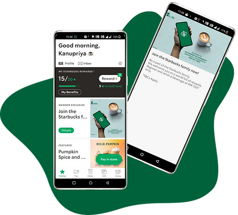
Task 4: Register your Starbucks Card
-
Most of the users were unsuccessful in adding the card, all the users started their journey by clicking join the Starbucks family which led to a dead end.
-
Only 1 user was successful in adding the card by going into the Pay option.
Suggested Interface
The app is redesigned by keeping in mind the Heuristic Evaluations, Insights from the usability study, SWOT Analysis, and Proposed Business model.


-
Starbucks Loyalty Card Registration on the homescreen.
-
Easy Profile access with App Settings.
-
Menu Categories accessible on the homescreen for ordering.


-
Food and feature cards segregated.
-
Search option gives suggestions based on the past search options and customised user recommendations.
-
Menu further categorised into Featured, Bestsellers and Previous Orders.


-
Drink and Customisation description with ingredients provided to the user to help in making an informed choice.


-
Better Visibility of Payment options (Starbuck Card) provided to the user.
-
Food delivery option integrated that would allow the users to use their loyalty benefits via Starbucks Delivery.
-
Track Order keeps the user informed about the ETA.

Reflection
I learned
Jakob Nielsen's 10 Usability Heuristics, which I used along with the Usability Study to identify the gaps in the existing product. I learned the business aspects of a product and how can I enhance it to increase the customer base, experience and revenue.
I would change
Currently, I focused on the overall application that has multiple important features. In order to create a much more comfortable user experience, I would like to concentrate on 1 task flow.
Additional Research and Documentation
Business Model Canvas

SWOT Analysis
.png)

